
The Psychology of Color in 2026: How Colour Trends Are Shifting and What Your Brand Palette Says to Your Customers
Color is never just color. It’s emotion, perception, and psychology wrapped in a visual shortcut. Before a customer reads your copy, checks your pricing, or clicks your CTA, they’ve already formed an opinion based on your colour palette. In 2026, that split-second judgment matters more than ever.
As digital spaces get noisier and attention spans get shorter, brands can’t afford to treat colour as decoration. Your palette is doing quiet but powerful work behind the scenes, shaping how trustworthy, modern, bold, or forgettable your brand feels. And as trends shift, so do expectations.
Let’s break down how colour psychology is evolving in 2026, what customers are subconsciously responding to, and what your brand colours are really saying about you.
Why Colour Psychology Still Matters (More Than Ever)
Humans are visual creatures. Studies consistently show that people form impressions within seconds, and colour plays a major role in that decision-making process. In a digital-first world, colour often becomes the first language your brand speaks.
In 2026, customers are more emotionally aware and more selective. They want brands that feel aligned with their values, their lifestyle, and their mood. Colour helps communicate all of that instantly.
A brand that understands colour psychology doesn’t just look good. It feels right.
How Colour Trends Are Shifting in 2026
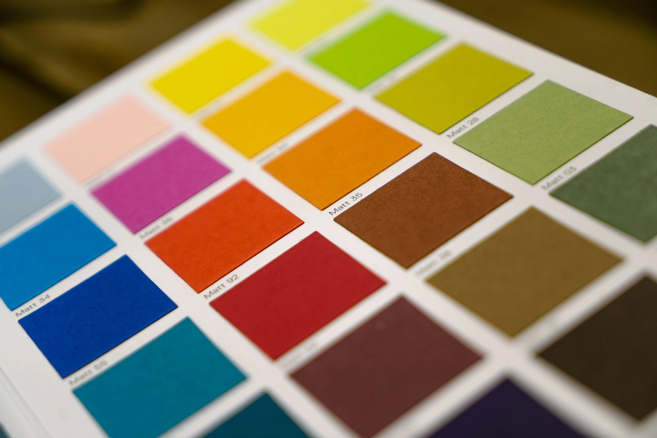
Colour trends in 2026 are moving away from extremes. We’re seeing less of the ultra-loud, hyper-saturated palettes and less of the overly sterile, muted minimalism. Instead, brands are landing somewhere in the middle: intentional, expressive, and human.
Here’s what’s shaping the shift.
1. Calm Is the New Confidence
Bold used to mean loud. In 2026, bold means calm and assured.
Soft neutrals, earthy tones, warm greys, clay, sand, muted greens, and grounded blues are becoming the foundation of many modern brand palettes. These colours signal stability, trust, and emotional intelligence.
Customers are tired of chaos. Brands that visually communicate calm instantly feel more trustworthy and mature.

What this says about your brand:
If your palette leans calm and grounded, you’re telling customers you’re reliable, thoughtful, and not trying too hard to impress.
2. Accent Colours Are Getting Smarter
Instead of full palettes screaming for attention, brands are now using accent colours strategically. One strong pop of colour against a neutral base can guide the eye, highlight CTAs, and create visual interest without overwhelming the user.
In 2026, it’s not about using more colour. It’s about using colour with intention.
A single coral button. A muted mustard highlight. A soft electric blue underline. Small details, big impact.

What this says about your brand:
You’re focused, intentional, and you understand visual hierarchy. You respect your audience’s attention instead of demanding it.
3. Emotional Colour Pairings Are Replacing Rigid Rules
Old-school colour psychology loved rigid formulas. Blue equals trust. Red equals urgency. Green equals growth.
In 2026, it’s more nuanced.
Brands are blending colours to create emotional experiences rather than relying on one-note meanings. Soft blues paired with warm creams feel human and safe. Deep greens combined with gold accents feel premium and intentional. Lilac mixed with charcoal feels modern and confident.
It’s less about what a colour traditionally means and more about how the combination makes people feel.
What this says about your brand:
You’re emotionally aware and experience-driven. You care about how customers feel, not just how things look.
4. Digital Brands Are Chasing Warmth
As AI, automation, and digital tools become more visible, brands are responding by visually humanising themselves. Cold blues and harsh blacks are being softened with warmth.
We’re seeing warmer whites, softer blacks, dusty pastels, and organic gradients replace stark contrasts. Even tech brands are leaning into palettes that feel more approachable.
In 2026, warmth equals trust.

What this says about your brand:
You’re approachable, human, and easy to work with. Customers feel like they’re dealing with people, not systems.
5. Colour Consistency Is Becoming Non-Negotiable
With brands showing up across websites, social media, emails, apps, and ads, consistency is no longer optional. In 2026, inconsistent colour use signals disorganisation and lack of clarity.
Customers notice when your Instagram looks one way, your website looks another, and your PDFs look completely different. That visual inconsistency quietly erodes trust.
Strong brands use colour consistently across every digital touchpoint, even when experimenting with trends.
What this says about your brand:
You’re professional, established, and intentional. You know who you are and you stick to it.
What Your Brand Palette Is Saying Right Now
Whether you realise it or not, your current colour palette is already communicating something.
Here are a few common signals:
Too many colours: Confusion, lack of focus, or trying to appeal to everyone.
Ultra-bright everything: High energy, but possibly overwhelming or immature.
All neutral with no accent: Clean and safe, but potentially forgettable.
Inconsistent use: Unclear brand identity or rushed execution.
Your palette should support your message, not compete with it.
How to Choose the Right Colours for 2026
Start with these questions, not trends:
How do I want customers to feel when they see my brand?
What emotions align with my services or products?
Does my current palette reflect where my brand is going, not just where it’s been?
Can my colours scale across digital platforms without losing clarity?
Trends should inspire, not dictate. The goal is longevity, not chasing what’s popular for five minutes.
Colour Is Strategy, Not Decoration
In 2026, colour is no longer a finishing touch. It’s part of your brand strategy.
The most effective brands will be the ones that understand this. They’ll use colour to build trust, guide behaviour, create emotional connection, and stand out quietly but confidently.
If your brand palette hasn’t been reviewed in a while, now is the time. Because your colours are already speaking. The real question is whether they’re saying the right thing.